What is the Color Contrast Analyzer?
The Color Contrast Analyzer is a feature in Accessibility Insights for Windows that helps developers investigate contrast ratios.
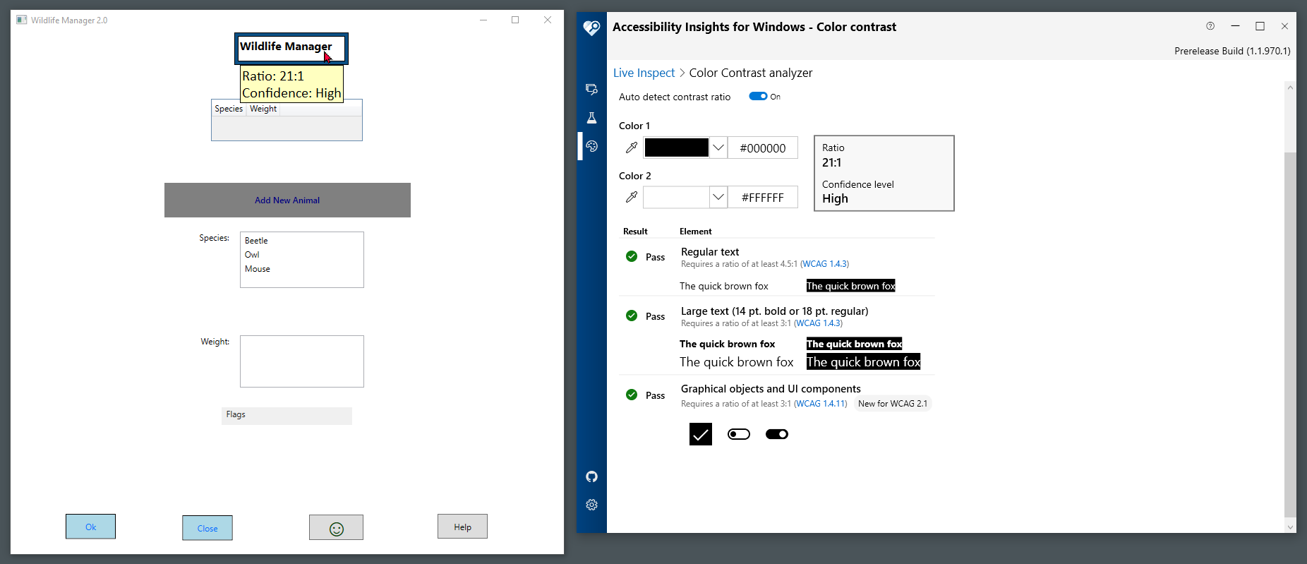
Contrast ratio describes the relative brightness of foreground and background colors on a computer display. In general, higher contrast ratios make text and graphics easier to perceive and read. Black and white have the highest possible contrast ratio, 21:1. Identical colors have the lowest possible contrast ratio, 1:1. All other color combinations fall somewhere in between.
You can also watch a short video to learn more about the Color Contrast Analyzer.
Why contrast ratio matters
Ensuring adequate contrast makes it easier for everyone to read text content, interpret graphical elements, identify UI components, and notice when those components change state. People with low vision often have difficulty reading text, identifying buttons that do not contrast with their background, or determining the state of UI components. The problems can be exacerbated if the person has a color vision deficiency that lowers the perceived contrast even further.
Minimum contrast requirements
According to WCAG 2.0 AA Success Criterion 1.4.3:
- Any text with a contrast of 4.5 or greater passes.
- Large text (18pt or 14pt bold) with a contrast of 3.0 or greater passes.
- Any text with a contrast below 3.0 fails.
According to WCAG 2.1 AA Success Criterion 1.4.11:
- Any UI component or meaningful graphical element with a contrast ratio of 3.0 or greater passes.
- Any active (non-disabled) UI component or meaningful graphical element with a contrast ratio below 3.0 fails.
NOTE: Do not round up contrast ratios. 4.499 does not meet the threshold of 4.5 for regular text.
How to test contrast ratio
Identify elements to test
Text
Examine the app you want to test and identify any instances of meaningful text that might have a low background-to-foreground color contrast.
You do not need to test any text that is:
- Part of an inactive (disabled) component
- Purely decorative
- Intended to be hidden from users
- Part of a flag, logo or brand name
UI elements
Examine the app to identify any UI components (controls) that might have:
- Low contrast against the background
- Low contrast between different states (normal, focused, mouseover, selected)
You do not need to test:
- Inactive UI components
- UI components whose appearance is determined by the browser and not modified by the author
Graphical elements
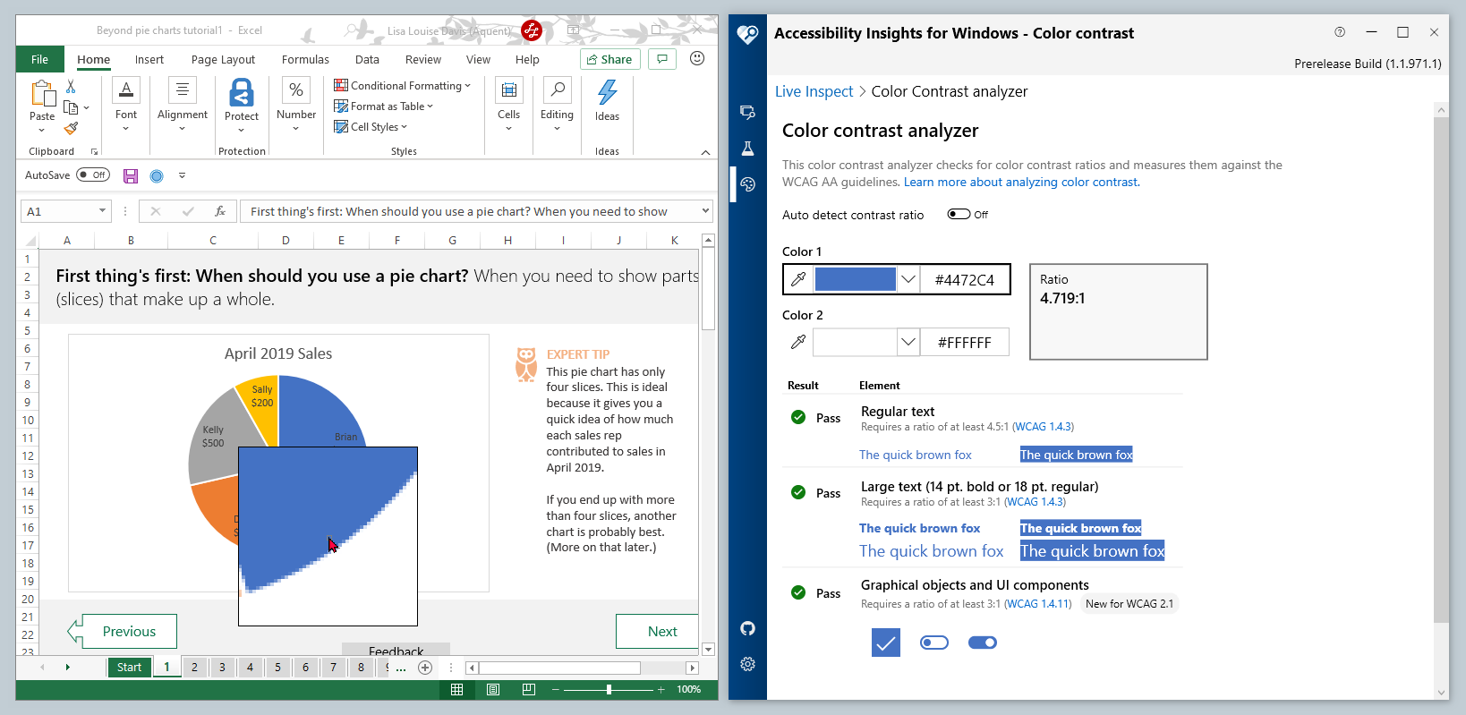
Examine the app to identify any graphical objects (such as icons, charts, diagrams, and illustrations) that contain meaningful elements that might have low contrast against the background.
You do not need to test any graphical object where:
- A particular presentation is essential, and presenting it with sufficient contrast would undermine its meaning. For example, logos, photos real life scenes, illustrations using realistic colors, and screenshots are exempt from the contrast requirement.
- The information conveyed graphically is also conveyed through visible text.
- The graphical object is purely decorative.
Launch the Color Contrast Analyzer
- Open Accessibility Insights for Windows.
- In the Navigation bar, select Contrast . (You can also press Ctrl+R).
Auto detect contrast ratio
Auto detect makes it easy to test the foreground/background contrast ratio of text elements. Auto detect is not recommended for use on icons or other graphical elements.
- Turn on the toggle for Auto detect contrast ratio.
- To auto detect a text element's contrast ratio, use your mouse to hover over the text (or set keyboard focus on the element).
- A tooltip will display the detected contrast ratio and confidence level.
- Accessibility Insights for Windows will display the same information and also indicate whether the contrast ratio passes the relevant WCAG 2.1 AA success criteria. (You can bring Accessibility Insights for Windows to the foreground by pressing Shift+F9).
- If Accessibility Insights for Windows is unable to detect the colors, or if the confidence level is low or mid, you must test the contrast ratio manually.
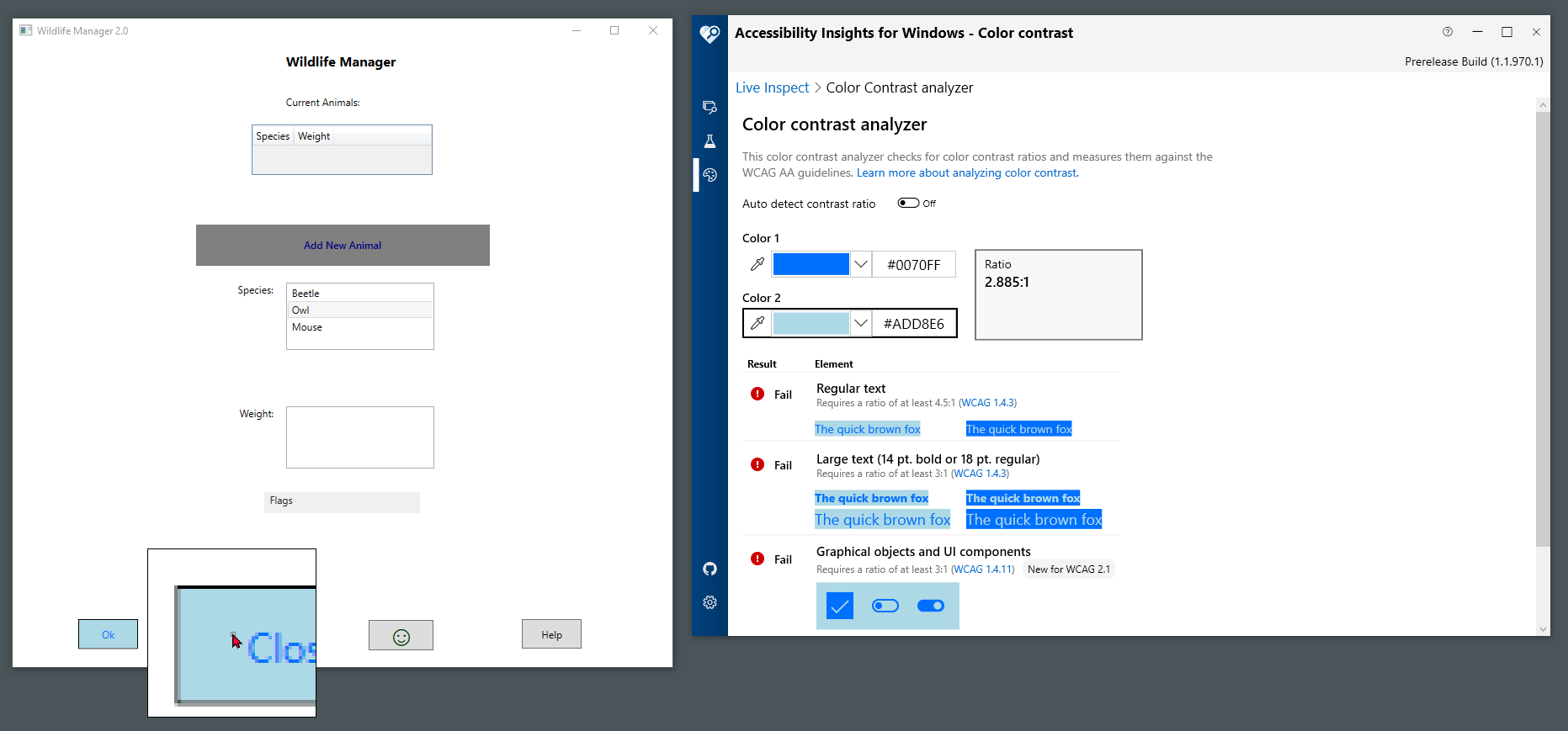
Manually check contrast ratio
Because auto detect uses a heuristic intended specifically for text, the contrast ratio of UI components and graphical elements must be tested manually. Also, when auto detect doesn't work on text, the contrast ratio must be tested manually.
- Turn off the toggle for Auto detect contrast ratio.
Text
-
Under Color 1, select the foreground color of the text (typically a horizontal or vertical portion of a character). To select a color, you can:
- Select the first Eyedropper, and select the pixel that accurately represents the text's color. You can also use the arrow keys to focus on the pixel and press the Enter key.
OR
- Select the color using the Color Picker box.
OR
- If you know the text's hex color code, enter it in the Hex Code box.
-
Under Color 2, select the background color. If the background is not a single color, such as a gradient or image, select the pixel that is most similar to the foreground color.
-
Examine Accessibility Insights for Windows to determine whether the contrast ratio passes the relevant WCAG 2.1 AA success criteria.
UI Components
- Interact with each UI component in the target app to determine which of the following states it can adopt:
- Normal
- Focused
- Mouseover
- Selected
- Identify any visual (non-text) indicators that communicate:
- The boundary of the component's clickable area
- The component's current state
- Test the component's foreground/background contrast in each supported state: 1. Under Color 1, select the color of the visual indicator. 1. Under Color 2, select the adjacent (background) color. To select colors using the Eyedropper, it might be necessary to take a screenshot of the UI component in its desired state (for example, using the Snip & Sketch tool) and then select colors from the screenshot. Alternatively, you might be able to get the hex color from the code.
- Examine Accessibility Insights for Windows to determine whether the contrast ratio passes the WCAG 2.1 AA Success Criterion for graphical objects and UI components (at least 3:1).
Graphical Objects
- For each graphic, identify the parts that are necessary for the graphic to be understood.
- Test the foreground/background contrast of each necessary state. 1. Under Color 1, select the foreground color. 1. Under Color 2, select the adjacent (background) color.
If the foreground or background includes multiple colors or a gradient, select colors with the least apparent contrast. - Examine Accessibility Insights for Windows to determine whether the contrast ratio passes the WCAG 2.1 AA Success Criterion for graphical objects and UI components (at least 3:1).